Recently a new client asked me to evaluate the state of his application development project.
I asked the team to share their architecture and design documentation with me. In response, they sent me a 25-page document that walked through the evolution of their data model and application layout, culminating with their system architecture diagram.
That diagram is supposed to be the answer to the most important question anybody can ask about the project: what will this thing actually be once we’ve built it?
Architecture is the highest level of design.
In this article, I will demonstrate:
-
What a good design artifact looks like.
-
What design artifacts are actually for.
-
How to use design artifacts efficiently to achieve a better outcome for your project.
The Curse of Generic Architecture
Here’s the capstone architectural diagram in the document I received from my client’s dev team:
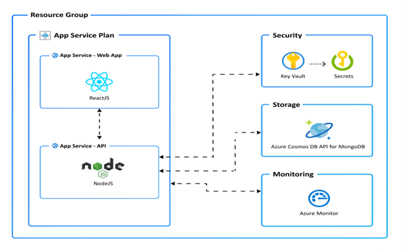
You will note that I have redacted nothing from this diagram!
Here in this public venue, I have presented every bit of specific, proprietary information contained in my client’s core architectural design artifact. Which is to say: none at all!
If you can post your core design artifacts in public without redacting anything from them, they’re too generic to be useful!
A generic architecture like the one pictured above is really just a statement of intent: Whatever the architecture of the system we wind up delivering, it’s going to have this shape.
This is a useful check on the final delivery: does it actually have that shape? But the process of design is very much the process of decomposing large problems into small ones… and in order to gain any traction at all, you’re going to need some specific problems to decompose.
Architectural Perspectives
Frank Gehry is arguably one of the world’s greatest living architects. One of his more famous buildings is the Museum of Pop Culture (MoPOP) in Seattle, Washington:

Like most of Gehry’s work, the MoPOP building is iconic and weird. Here’s one of Gehry’s architectural sketches of the building:
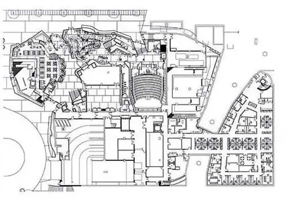
How do we know this image qualifies as architecture?
-
It tells us some very specific things about the building, like where people can walk and where they can’t, but…
-
The contractors are going to need a lot more detail before they can actually build the thing.
There are also some high-level things missing from this plan.
How is the building supposed to feel? Based on the plan above, a contractor could build a Gothic cathedral or a space-age rocket lounge. But accounting for feelz would not help this sketch communicate the building’s layout any more clearly than it does.
Gehry’s plan sketch has the clarity it has precisely because that information isn’t in there!
Here’s another Gehry sketch of the same building:
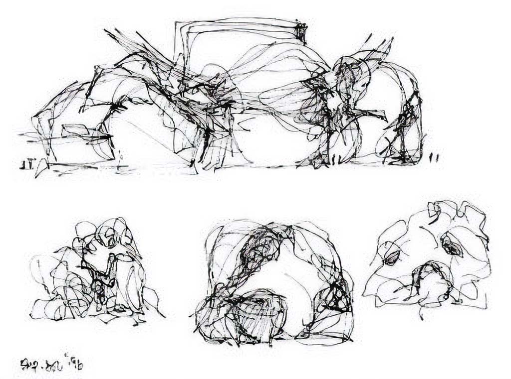
This one tells us nothing at all about where the walls and windows go, but it tells us a lot about how the building is supposed to feel.
Put these two sketches together, and there still isn’t enough information to tell a contractor how to get it right. But there’s plenty of guidance here about what questions Gehry’s junior architects should be asking as they translate these sketches into a detailed plan!
Good high-level design isolates key perspectives on a system so its problems can be seen and decomposed.
Design Artifacts
When an architect delivers a design, what exactly should he be delivering?
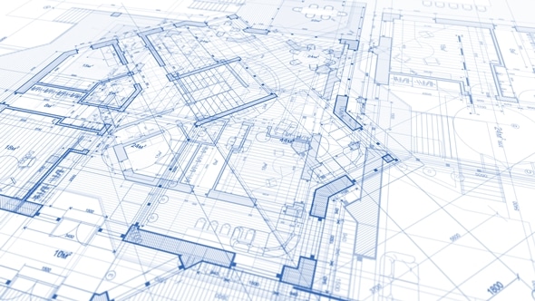
As the Gehry sketches above suggest, the main medium of communication in design is visual, and the key deliverable artifact in any design is some kind of a drawing:
-
At a high level, where there are more questions than answers and decomposition is the driving concern, a design drawing looks more like a sketch.
-
At a low level, where there are more answers than questions and implementation is the driving concern, a design drawing looks more like a diagram.
This isn’t to say that a design drawing shouldn’t be accompanied by words. Au contraire!
Completeness
A design drawing is a highly compressed form of communication, which deliberately sacrifices detail and completeness in favor of clarity. It appeals to the part of the human brain that understands abstractions.
At the same time, that abstract thing actually has to be built… and the devil’s in the details. Those details appeal to the part of the human brain that understands concretions.
So a complete design artifact contains…
-
a drawing that fits on a single page & conveys its essential message at a glance, and
-
a document that unpacks the message and declaratively asks the questions to be answered by the next-lower level of design.
A complete design artifact is the drawing that encapsulates the design plus the document that unpacks it.
Internal Consistency
If you’ve ever run a business, you’ve probably wrestled with double-entry bookkeeping. The idea is that every transaction is recorded twice, once as a debit and once as a credit. Doing everything twice is a huge pain in the neck, but it also delivers a major superpower.
Just add up all the debits and all the credits for the month. If the results don’t match, you know you have an error in your books! You were able to catch it because double-entry bookkeeping makes it easy to check the consistency of your records.
Good design artifacts work the same way.
Once you’ve taken the trouble to represent your design as both a drawing and a document that reflects it, you can ask the single most important question in the design process: do these two descriptions represent the same thing?
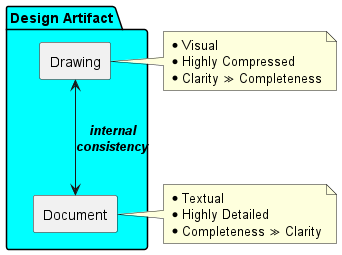
If they do, then your design is internally consistent, and anything you build on the basis of that design—at least as expressed at that level—is likely to turn out the way you expect.
If they don’t, then whatever you build will never turn out the way you expect… because you have written down two different sets of expectations!
An internally consistent design artifact is one where the drawing and the document that unpacks it actually describe the same thing.
A bookkeeping error discovered before you submit your quarterly report is way less expensive than one discovered after you submit it.
In exactly the same sense, an error discovered at design time is far less costly than one you discover after your code is in production!
External Consistency
What about the artifacts at higher and lower levels of abstraction?
A complete and internally-consistent high-level design artifact will pose lots of questions and offer few very concrete answers. It’s abstract by nature.
Each of the questions it poses will likely be answered by a lower-level design artifact, which also should be complete and internally consistent. For example:
-
High-Level Design: We need a User API with support for authentication & user profiles. What should it look like?
-
Low-Level Design: The User API should look like this.
Given that these two artifacts exist, here’s a point worth investigating: does the low-level design drawing actually answer the questions posed by the high-level design document?
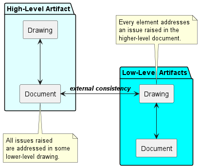
This is external consistency, and it exists between design artifacts at different levels of abstraction.
An externally consistent design artifact is one whose drawing answers its share of the questions raised in higher-level artifacts, and whose document raises questions that are all answered in lower-level artifacts.
Now you have a chain of consistency. At one end are the highest-level business requirements, and at the other end is the code that (eventually) implements them.
In the middle is a hierarchy of design artifacts that…
-
progressively decompose the problem, and
-
support checks on internal and external consistency, and
-
collectively guarantee that what winds up in production will actually reflect business requirements.
Consistency is the basis of all error detection. Complete and consistent design artifacts provide to your engineering team what double-entry bookkeeping provides to your accountant: a reliable method of catching errors before they put you out of business!
A Redacted Example
It’s time to take a stab at demonstrating what really useful design artifacts actually look like… and we’re immediately going to run into a problem:
Really useful design artifacts are specific to the problem they’re solving, and proprietary to the organization that’s solving it!
Consequently, they’re also a lot of work to produce. So rather than spending a couple of weeks solving an entirely fictitious problem, in the sections that follow I will…
-
Present heavily redacted versions of real high-level design drawings that address selected perspectives on a very real client’s architecture. If you focus on the form rather than the content of these drawings, you’ll get everything you need from them.
-
Talk about the associated documents rather than presenting redacted versions, because the redactions would be so extensive as to render the documents themselves unreadable.
-
Focus on the highest level of abstraction. This is where the most important questions are raised, and where the most important decisions are made. I will address intermediate- and lower-level design artifacts in future posts.
The Scenario: VeteranCrowd
VeteranCrowd (who have given me permission to use their name and some of their design artifacts) is a FinTech startup whose platform makes it possible for Merchants to offer great deals to US Military Veterans and members of other exclusive groups.
The experience is completely frictionless: no loyalty points, no coupon code, no landing pages… in fact no websites, as the service works just as well at the cash register as online!
The VeteranCrowd application is built on a microservice architecture and has a lot of moving parts. It’s designed from the ground up to scale to millions of users and billions of transactions annually.
The application has a complex ecosystem of stakeholders, including Users, who make purchases at Merchants, who make Offers to the Groups that Users belong to… plus many more!
In the sections below, we’ll look at high-level design artifacts addressing two distinct architectural perspectives on the VeteranCrowd application:
-
The Core Business Process: What is the core experience—shared by all VeteranCrowd stakeholders—that pushes money around?
-
The Application Platform: What is the physical infrastructure that supports this business process and connects all stakeholders?
Core Business Process
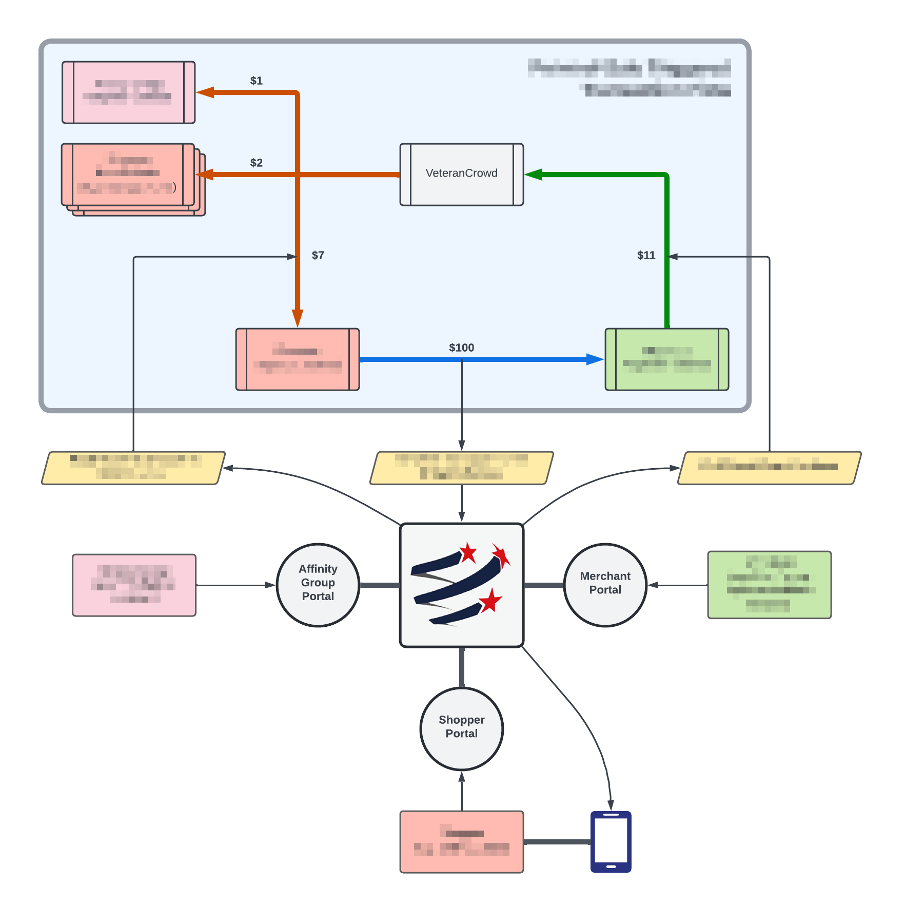
This drawing is part of a high-level design artifact that encapsulates the core business process of the VeteranCrowd application. Using the terminology we developed above, it’s more of a sketch than a diagram, and is intended to raise questions rather than answer them.
Some key questions asked in this design artifact’s document:
-
Does the application present distinct user interfaces to each of its stakeholders, or are they unified?
-
How does the application handle the flow of money between stakeholders?
-
What kind of latency does the application promise? Is it a real-time experience?
-
How much of what we see here should be configurable, and at what level?
-
What kinds of metrics are required to provide accountability to stakeholders and inform internal business decisions?
-
What kind of security is required to protect the interests of stakeholders?
-
What compliance issues are raised by the application’s core business process?
-
Are these really all the stakeholders? What happens if we identify new ones?
-
What kind of support is required for the application to be successful?
-
How important is the mobile experience? Which stakeholders does it apply to, and can we get there step-wise?
There were many more questions raised by this drawing, and the associated document unpacked them in detail. The answers to these questions were then used to drive the next level of design.
Key point: this artifact has evolved over time! In its current version, it is nothing like the first version we produced.
In fact, we revisit this and other design artifacts regularly in scheduled design reviews, and as business requirements evolve we spend a significant amount of time and energy keeping our design artifacts in sync with one another and with the current state of implementation.
The road connecting requirements to design to implementation is a two-way street.
Application Platform
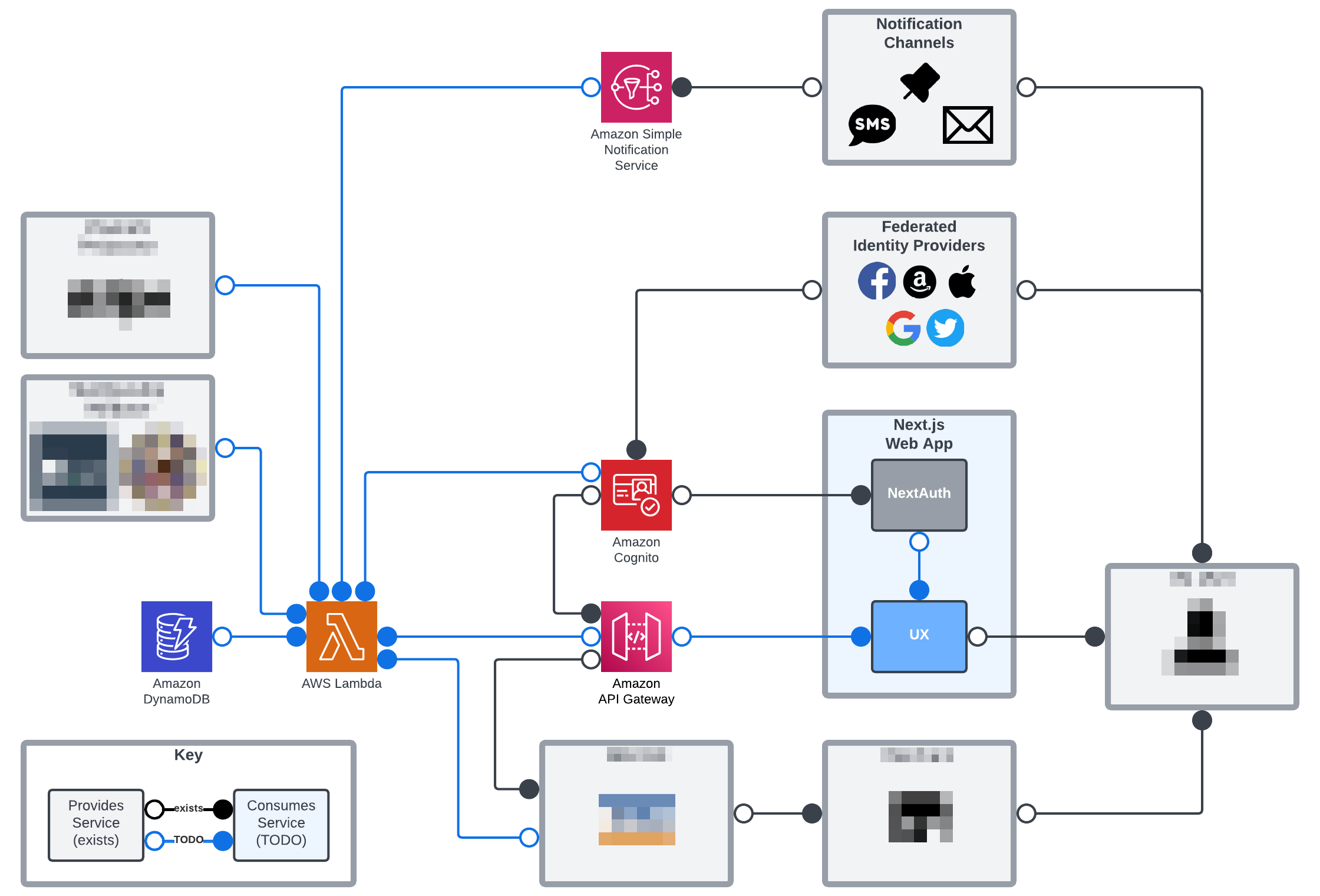
We asserted above that a design drawing is a highly compressed form of communication. If communication implies content, then this statement must also be true:
In a great design drawing, every symbol has meaning.
In the above diagram:
-
Lines connect system components that either provide services or consume them.
-
Open circles represent services provided, usually in the form of an API or a user interface. In this compressed view, one open circle can represent many services provided.
-
Solid circles represent services consumed, either programmatically or manually. In this compressed view, one solid circle can represent many services consumed.
-
Black lines & circles had already been implemented at this revision. Blue lines had not.
There is no component of this drawing that is not intended to communicate something, and the document that unpacks it is dense with detail.
Key questions asked at this level:
-
For each entity providing or consuming services: which ones? How many? What kinds of data do they exchange, and with what degrees of latency?
-
For the blue symbols, based on the indicated dependencies, what is the correct order of implementation and estimated level of effort? In other words: what does the roadmap look like?
-
Do any of the indicated interfaces share requirements that could be encapsulated into common dependencies? If so, what are they?
-
Just how monolithic are the indicated entities? How do they break down, and should their components be treated the same or differently?
We’re looking at a dated revision of this artifact because it did in fact fall out of sync and was replaced by another one that was easier to maintain. I’m showing you this one because this is where we started.
Why change? We implemented the drawing above in LucidChart. It makes pretty diagrams, but they can be a pain to update as requirements change.
Most of our current design artifacts are implemented in PlantUML. The diagrams aren’t as pretty, but they’re implemented and version-controlled as code, right next to application code when appropriate, and can be maintained & updated in the same code editor we use for everything else.
There’s another key lesson in this:
The easier it is to maintain a design artifact, the more likely it is to remain useful over time!
In future posts, I’ll dig deep into the nuts and bolts of making your design process as frictionless as possible.
At the end of the day, the point of design is to help get your product out the door at the best achievable balance of quality and price. If your design process costs more time and energy than it contributes in clarity and quality, your team will abandon it and rightly so.
Next Steps
Most readers of this article will not have the luxury of starting from scratch with a proper design process.
Your project probably already has a fragmented code base, a disjointed stack of business requirements, and a hyper-generic system architecture diagram much like the one at the top of this article.
Your product manager already breathes fire down the back of your your neck every morning. So what can you do?
In a healthy project, design artifacts and project documentation are the same thing.
Start From Where You Are
One more time, for emphasis: in a healthy project, the design artifacts are the project documentation!
If you had followed this process from project inception, you would have generated your high-level design artifacts, decomposed them into low-level artifacts, written your code, and kept the whole pile in sync with itself as the build progressed. There’s a box in your project plan called “project documentation,” and you’d have been checking it off as you went along.
If you didn’t have that luxury, then you still have a budget for project documentation, which is probably largely unspent. So spend it!
Most people who write code for a living find that the hardest part of the design process outlined above is creating those drawings. We (and I’m no exception!) tend to come at things from the other side of our brains.
But the good news is that, if you are documenting a system that already exists, you have a huge advantage over the person who had to invent it from scratch: it’s right there in front of you! The job of documenting it is more synthesis than abstract invention.
Way easier! So…
-
Pick somebody who understands the system at a low level and can use a drawing tool. Ask him to create a drawing to represent each self-contained code module. APIs are a good place to start.
-
Got a Business Analyst (BA) on the team? Ask him to create a set of drawings describing key perspectives on the application as a whole. No BA? Do it yourself, or assign the job to the most business-facing member of your team. Your product manager probably needs a break from breathing fire down your neck. 🤣
-
Budget the work over time. After all, you still have to progress the build!
Once you have even a minimal set of design drawings that describe your system at key levels of abstraction, you’ll find the work becomes much easier. For each drawing, you can ask:
-
How does this picture implement my higher-level requirements, or connect to the associated diagram if I’ve already drawn it? The answers go on the higher-level document!
-
How does this picture translate into lower-level requirements that are captured in a lower-level diagram or or implemented in code? The answers go on this picture’s document!
-
What existing documentation can I leverage to make this easy? Much of what you need has probably already been written down, if you can find it.
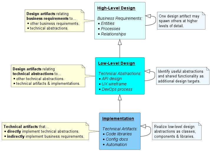
The outcome of this process will be a set of design artifacts representing the current state of your system at different levels of abstraction. They might not be completely consistent, neither internally nor externally, but they’ll be a strong start.
Iterate
Schedule weekly design reviews. At each review, pick a handful of related diagrams and for each one ask:
-
Is the drawing in this design artifact internally consistent with the document that unpacks it?
-
Is this design artifact externally consistent with any higher-level artifacts that drive it, and lower-level artifacts or code that it drives?
-
Are any design artifacts missing from the set? If so: what are they, and what should they look like? Write that stuff down on a design ticket and throw it into your backlog!
At this point, you are already using your design artifacts and process the way they are meant to be used. The only difference between your case and the ideal is that your artifacts are not as well-synced as they would be if you’d been running the process all along.
Not to worry! After all, requirement changes happen all the time, and any major requirement change will also throw your design artifacts out of sync with one another and with the build.
So this is just the job. Much like regular backlog grooming, nobody expects it to be done, at least not for long. The job is to keep the design backlog closely-enough in sync that it serves these two critical purposes:
-
It’s a check on consistency between your requirements and your build, allowing you to detect as early as possible those points where business requirements and technical implementation fall out of sync.
-
It’s a source of tasking, allowing you to translate detected inconsistencies into actionable work items that can be prioritized, sized, and scheduled as part of your regular backlog grooming process.
Conclusion
Properly conducted, design is process.
If your project started as an idea and evolved into a product, then you have already engaged in a design process. This is inescapable. So the question you should ask yourself is this:
Have you engaged in your design process on purpose… or by accident?
Most processes deliver better outcomes when they’re conducted on purpose, and the design process is no exception.
The process outlined above is certainly not the only way to engage in design… but it’s a good one, and it aligns well with other Agile processes that most teams already use.
If you decide to adopt this process in your own project, you won’t go far wrong.
Do good work! 🚀

